Doctor Logo Design: 12 Principles for Clinic, Hospital and Medical Logos
A doctor’s logo is read in more places than any other piece of the brand — on the signboard, the prescription pad, the WhatsApp display picture, the staff ID card and the Google Business Profile. These are the twelve principles we use when we design logos for doctors, clinics and hospitals, the symbols to keep away from, and what the finished system should include.
The short answer: good doctor logo design starts from the patient, not the specialty symbol. The logo must read at 16 pixels and on a signboard across the road, work in one colour on a photocopied prescription, avoid protected symbols such as the Red Cross, leave room for the doctor’s name, degrees and registration number, and arrive as a system — primary logo, monogram, lockups and a guidelines board — not as a single file.
What a doctor’s logo has to do
Most medical logo design briefs ask for something that looks “professional and trustworthy”. That is the minimum, not the goal. A clinic logo is the one element a patient sees before they meet the doctor: on Google Maps, on the board outside, on the appointment message. It has to be recognisable at a glance, remembered after one visit and consistent everywhere it appears. A hospital logo carries the extra load of many departments, many signboards and hundreds of staff ID cards — so it has to hold up when other people apply it.
That is why we judge a healthcare logo design by how it performs in use, not by how it looks on a white presentation slide.
The 12 principles of medical logo design
1. Start from the patient, not the specialty
Ask what a patient should feel when they see the mark — reassured, welcomed, in expert hands, pampered — before choosing a single shape. A paediatric clinic and a cardiac hospital both treat hearts in a sense; their logos should feel nothing alike.
2. Make it legible at 16 pixels and at 10 metres
The same mark appears as a browser favicon and on a building. Fine lines, thin serifs and small text inside a symbol disappear at small sizes and blur at a distance. When we built the ZYNTRONEX identity, the two-stroke mark was tested from a 16 px favicon to a six-metre event wall before anything else was designed. Run the same test for a clinic logo.
3. Design in one colour first
Prescriptions get photocopied, letterheads get faxed to insurers, and signboards get printed on vinyl in a single colour. If the logo only works in its brand colours, it does not work. Approve the black version before the colour version.
4. Choose colour for mood, then check it against your neighbours
Blues and teals signal calm and competence, which is why so many clinics use them — and why so many look alike. Pick one colour that suits the specialty and the patients, then walk the street. If three clinics nearby share it, shift the shade or the accent.
5. Plan a bilingual lockup from day one
In Chennai, a signboard often needs the clinic name in Tamil as well as English. Draw the Tamil version as part of the system, with the same weight and spacing, rather than typing it in later in whatever font the printer has.
6. Never use the Red Cross
This is the most common legal mistake in hospital logo design. In India the Red Cross emblem is protected under the Geneva Conventions Act, 1960: Section 12 bars its use without Central Government approval and Section 13 sets the penalty, which also covers designs that resemble it. It is reserved for the medical services of the armed forces and the Red Cross movement — not for private doctors, clinics, hospitals, ambulances or chemists. A green or blue cross does not solve the problem if it still reads as the emblem.
7. If you use a snake, use the right one
The traditional symbol of medicine is the Rod of Asclepius: one snake around a single staff. The caduceus — two snakes and a pair of wings — belongs to Hermes, the god of commerce, and is used for medicine mostly by mistake. Better still, ask whether the logo needs a classical symbol at all.
8. Treat the clichés as a starting point, not an answer
The stethoscope, the heartbeat line, the plus sign, the tooth outline and the leaf appear on thousands of medical logos. Use one only if you can give it a twist that belongs to you; otherwise a distinctive monogram or wordmark will be remembered longer.
9. Build a monogram and lockups, not one logo
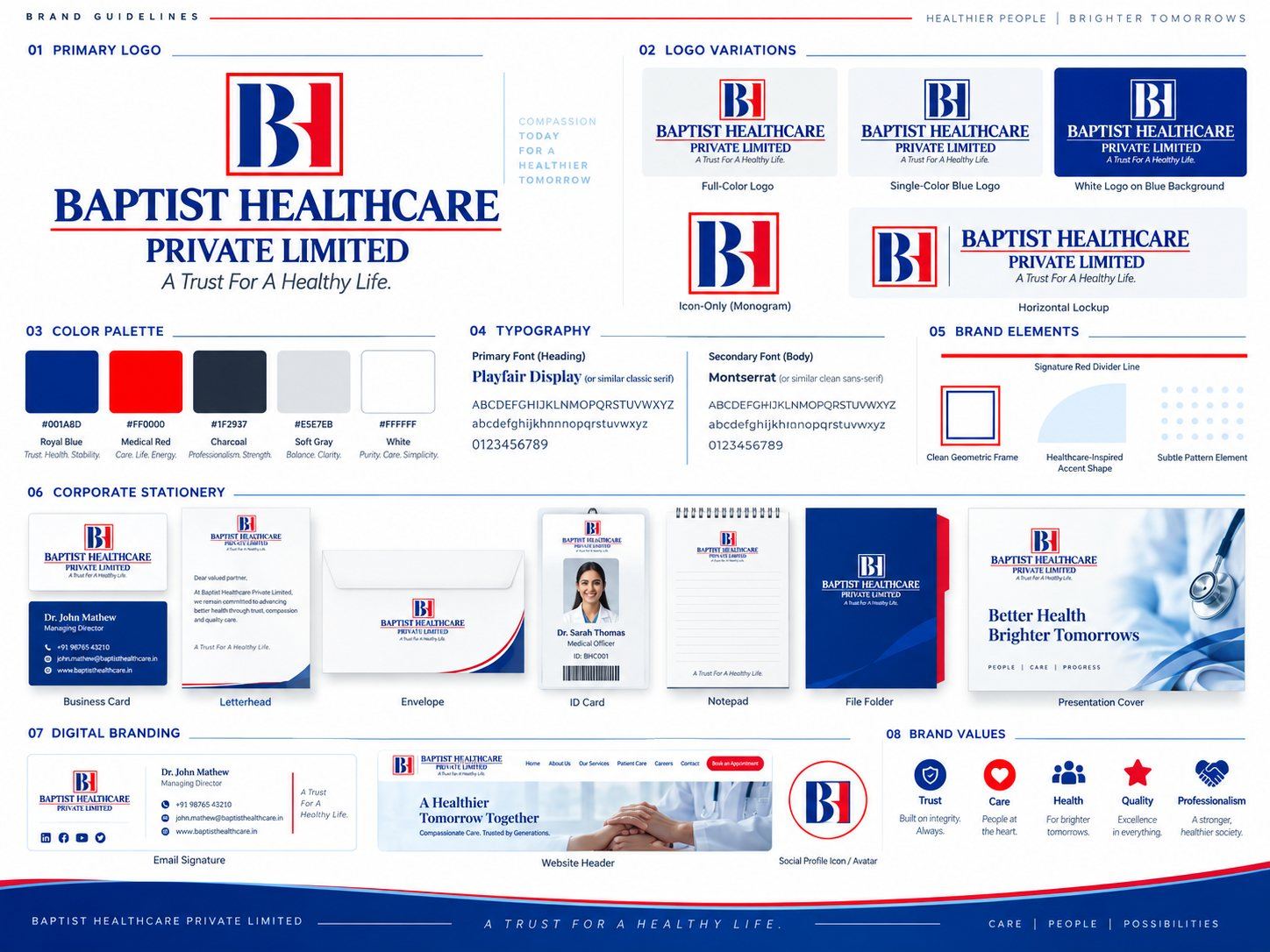
A clinic needs a primary logo, a monogram for small spaces such as the WhatsApp display picture, a horizontal lockup for signboards and website headers, and a stacked lockup for square spaces. Our Baptist Healthcare corporate identity was delivered this way: primary logo and monogram with a full variation set, governed by one guidelines board.
10. Leave room for the name, degrees and registration number
The logo sits beside the doctor’s details, it does not replace them. Under the Medical Council of India’s 2002 professional conduct regulations, which the National Medical Commission publishes, a doctor displays their registration number in the clinic and on prescriptions (Reg. 1.4.1), and the signboard and prescription paper carry the name, recognised qualifications, titles, specialty and registration details (Reg. 7.13). The same regulations treat a self-photograph or publicity material on a letterhead or signboard as self-advertisement (Reg. 6.1.2). NMC’s 2023 conduct regulations were put on hold in August 2023, so check the current position with your State Medical Council before you print.
11. Design for the whole clinic, not one file
A logo proves itself on the things around it: visiting cards, prescription pads, letterheads, staff ID cards, appointment cards, the glass partition and the signboard. Our Full Clinic Kit concept shows one identity carried across all of them. Ask to see your logo on at least five real applications before you approve it.
12. Write the rules down
A guidelines board — clear space, minimum size, colours with print and screen values, approved fonts, and a short list of do’s and don’ts — is what keeps the logo intact when a printer, a signage vendor or a new receptionist uses it. Without one, the mark drifts within a year.
Clinic, hospital and specialty logos: what changes
| Type | What the logo must carry | Watch out for |
|---|---|---|
| Doctor or single-specialty clinic | The doctor’s personality and specialty; often a monogram from the doctor’s or clinic’s initials | Looking like a pharmacy or a chain |
| Multi-specialty hospital | Stability and scale; a mark that survives department sub-brands and wayfinding signage | Detailed symbols that fail on signage and ID cards |
| Dental clinic | Friendliness and calm for nervous patients | The tooth outline every competitor uses |
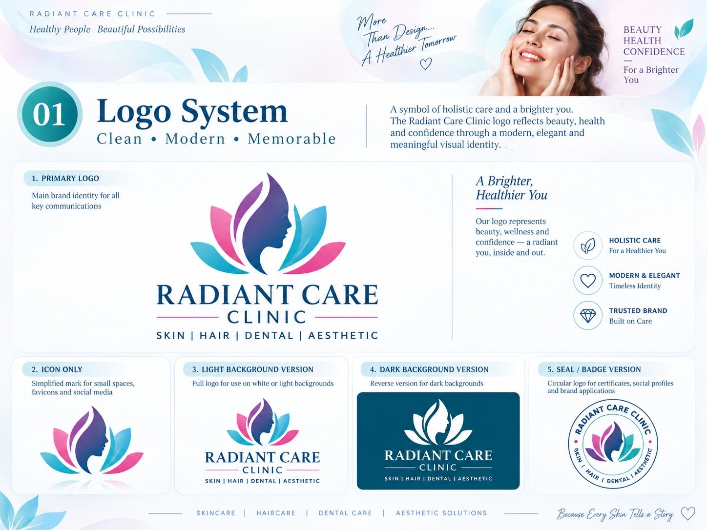
| Skin, aesthetic or dermatology clinic | A premium, considered feel closer to beauty than to hospital | Over-styled scripts that are hard to read small |
Examples from our studio
Baptist Healthcare needed a corporate identity for a healthcare group with more than 25 years of family heritage. The work covered the primary logo and monogram with a full variation set, a five-colour palette, stationery from business cards to presentation covers, staff ID cards and a digital kit, all governed by one guidelines board. You can read the family story in Baptist Healthcare’s digital-first legacy.
Ziva Skin Clinic already had an identity. For its tenth anniversary we designed a celebration mark built on that identity rather than replacing it — a useful reminder that clinic logo design is sometimes about extending a mark patients already trust.
The Full Clinic Kit is a concept board that shows how far a clinic logo can travel: logo system, visiting cards, prescription pads, social media templates, posters, signboard and glass-partition branding, and appointment cards. Every piece is on our branding and logo design page.
Check your current logo in five minutes
- Set it as a WhatsApp display picture. Can you still read it?
- Photocopy a prescription in black and white. Does the logo survive?
- Look at it on your signboard from across the road. What do you see first?
- Does it contain a red cross, a caduceus or a symbol three nearby clinics also use?
- Is there a written guide your printer could follow without calling you?
Two or more “no” answers usually mean the logo needs a refresh rather than a redesign — a monogram, a one-colour version and a guidelines board often fix most of it.
If you are planning a new clinic or a rebrand, we design doctor, clinic and hospital logos as complete systems from our Chromepet studio — logo, stationery, signage and digital kit under one accountable roof.
WhatsApp us with your clinic name and specialty, and we’ll reply with a scope and quote within one working day.
Frequently asked questions
What makes a good doctor logo design?
A good doctor logo is legible at the size of a WhatsApp display picture and on a signboard across the road, works in one colour on a photocopied prescription, avoids protected or overused symbols, and comes as a system: a primary logo, a monogram and horizontal and stacked versions. It should feel like the doctor, not like a pharmacy chain.
Can a clinic or hospital use the Red Cross in its logo?
No. In India the Red Cross emblem is protected under the Geneva Conventions Act, 1960. Section 12 bars its use without Central Government approval and Section 13 sets the penalty, which also covers designs that resemble it. Private doctors, clinics, hospitals and chemists should use a different mark.
Which medical symbol should a doctor use in a logo?
If you want a classical symbol, the Rod of Asclepius — one snake around a single staff — is the traditional symbol of medicine. The caduceus, with two snakes and wings, belongs to Hermes and commerce and is often used by mistake. Many strong medical logos use no symbol at all and rely on a distinctive monogram.
What colours work best for a medical logo?
Blues and teals still signal calm and competence, but they make clinics look alike. Choose one colour that suits your specialty and your patients, then test it in black and white, on a signboard at night and on a WhatsApp profile. A clinic logo that only works in its brand colour is not finished.
Should a doctor's logo include their name and degrees?
The logo itself can be a mark or a clinic name, but the doctor's full name, recognised degrees and State Medical Council registration number must appear beside it on prescriptions and the clinic board. Plan that space into the letterhead and signboard layouts from the start.
How many versions of a logo does a clinic need?
At minimum: a primary logo, a monogram or icon for small spaces, a horizontal lockup for signboards and website headers, a stacked lockup for square spaces, and one-colour versions in black and white. Most clinics also need a Tamil or bilingual lockup for local signage.