The 7-Second Test: What Your Clinic Website Homepage Says About Your Practice
A patient who lands on your clinic website homepage decides whether to stay or go back to Google in about seven seconds — before the first scroll, before reading a paragraph, before seeing your credentials. This is what they are checking in those seconds, the seven questions a dermatology, aesthetic or dental clinic homepage has to answer instantly, the mistakes that fail the test most often, and a test you can run on your own site tonight with a phone and a friend.
The short answer: in the first seven seconds a patient needs to answer five things from your homepage without scrolling — what you treat, where you are, who the doctor is, why they should trust you, and how to book. A clinic homepage design that answers all five above the fold, on a phone, with a real photo and a WhatsApp button, passes. One that opens with a stock model and "Welcome to our website" fails, however beautiful the rest of the page is.
Why seven seconds
The number is not a slogan. Usability research going back two decades puts first-impression judgements of a web page in the range of a few seconds; Google's own study on visual appeal found people form an aesthetic judgement in as little as 50 milliseconds and a credibility judgement within the first several seconds of a visit. Our own work is more specific: when we sit real patients in front of clinic homepages we have built or been asked to fix, most decide whether to keep reading or press back within roughly seven seconds, and almost none have scrolled by then.
What makes this brutal for clinics is where the patient came from. They typed "skin clinic chromepet" or "dental clinic near me" into Google, or asked ChatGPT, and opened three tabs. Yours is one of three. Seven seconds is the audition, and the other two tabs are waiting.
What patients check on a clinic website homepage
Patients do not consciously run a checklist, but when we ask them afterwards why they stayed or left, the same five questions come up every time. Add two that matter on Indian mobile connections, and you have the 7-second test.
1. What do you treat?
"Advanced Aesthetic Solutions" is not an answer. "Acne, pigmentation, laser hair removal and anti-ageing — dermatologist-led" is. The treatment names patients search for should be visible in the headline or the line under it, in the words they use. If your homepage headline could belong to any business, it fails this one.
2. Where are you?
Locality, not just city. "Chromepet, Chennai" above the fold does two jobs: it tells the patient you are reachable, and it tells Google and AI engines which local searches you belong in. Clinics that bury the address in the footer lose both. Our Chromepet local SEO playbook covers how far this one line carries.
3. Who is the doctor?
A name, a qualification and a face. Patients are choosing a person, not a building. A homepage with no doctor visible reads as a franchise or a front. This is the single strongest trust element on a clinic homepage, and it costs nothing.
4. Why should I trust you?
One proof, visibly placed: a Google rating with the review count, years in practice, a recognisable affiliation, or a count of patients treated. Not all of them — one, clearly. A row of six badges reads as noise; "4.9★ from 212 Google reviews" reads as fact.
5. How do I book?
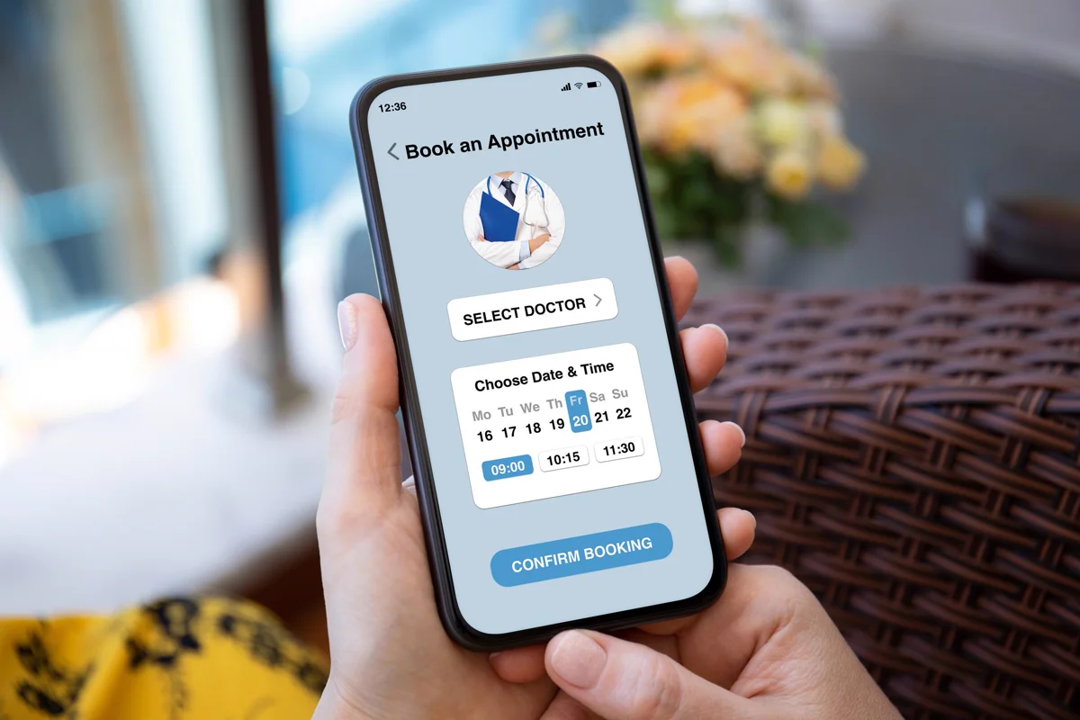
One obvious action. On Indian clinic websites that action is WhatsApp: a button in the hero and a floating button that stays on screen. Our measurements across clinic sites show WhatsApp calls-to-action convert four to seven times higher than contact forms, and a form as the only option is the most common way a good homepage loses the enquiry. When a clinic outgrows WhatsApp there is a right way to add a booking system — but the button stays.
6. Does it load?
Seven seconds includes load time. A homepage carrying a 4 MB hero video on a 4G connection in Tambaram has spent the whole budget before showing anything. Aim for the first meaningful content inside two seconds on mobile; compress images to WebP, defer video, and keep scripts out of the way of the first paint.
7. Is it real?
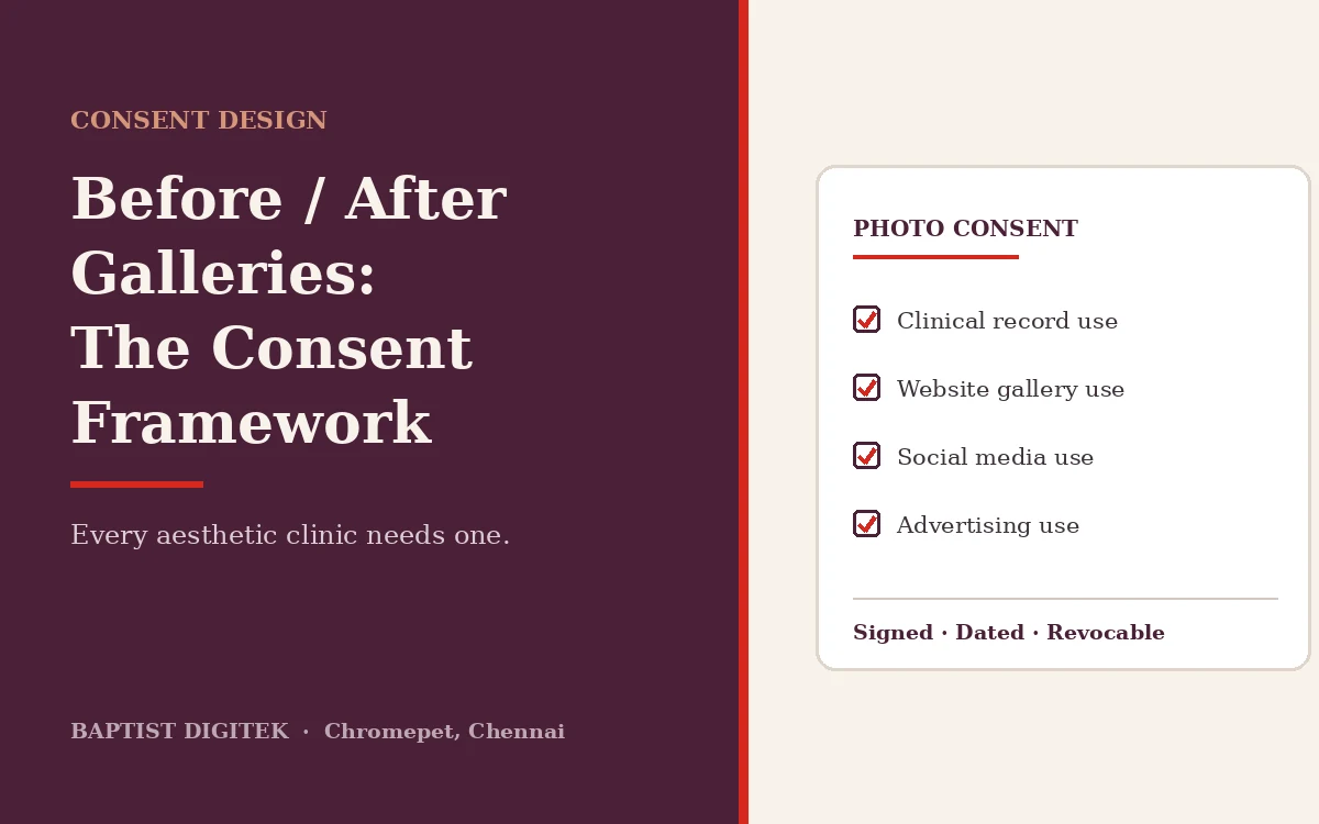
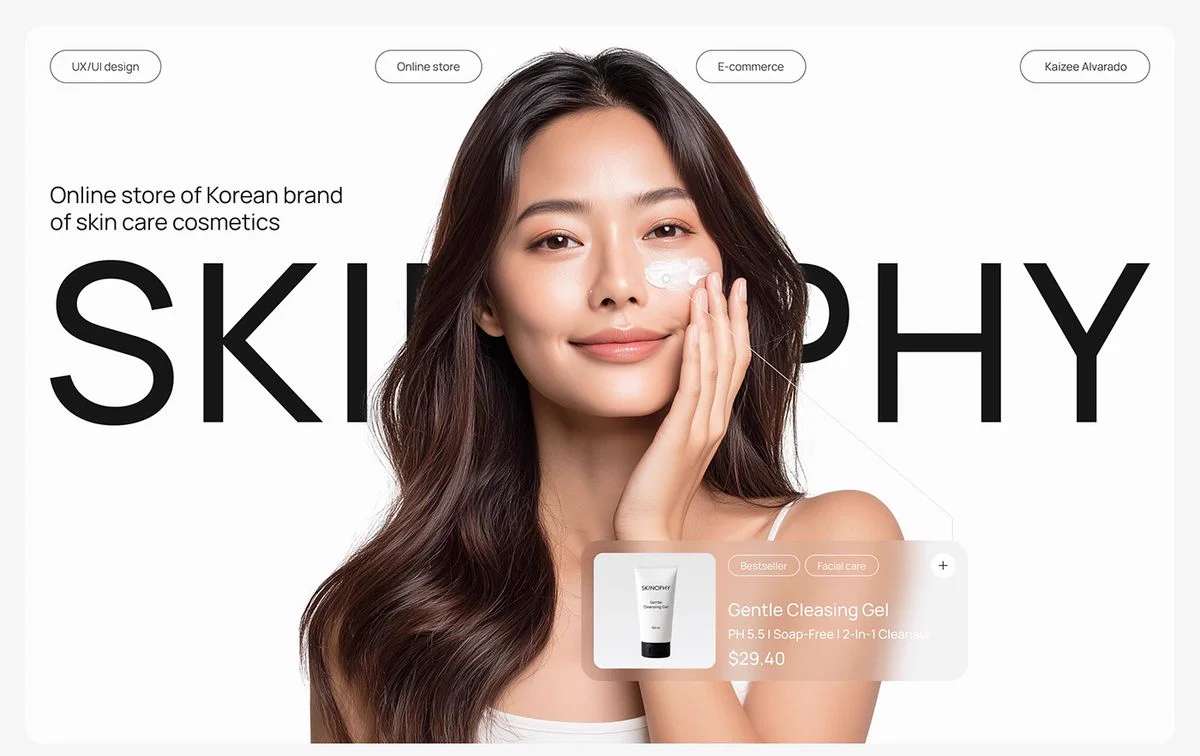
Stock photography is the most reliable way to fail the test. Patients recognise the smiling model with perfect skin instantly and read it as "they are hiding something". A real photo of the doctor, the reception, or a treatment room — even one taken on a phone in good daylight — beats a professional stock image every time. If you use before/after photos, they need written, revocable consent under India's DPDPA; our consent framework explains what that involves.
The mistakes that fail the test most often
| What we see | What the patient reads | Fix |
|---|---|---|
| "Welcome to XYZ Clinic" as the headline | Nothing — the seconds are spent | Treatment + locality + who, in one line |
| Stock model as hero image | Not a real clinic | Doctor or reception photo |
| Auto-playing slider with four messages | Can't focus; misses all four | One static hero, one message |
| Contact form as the only CTA | Too much effort right now | WhatsApp button in hero + floating |
| No address until the footer | Probably far away | Locality under the headline |
| Treatment list of 40 items | They do everything, so nothing well | Five flagship treatments, "see all" link |
| Doctor hidden on an About page | Who am I trusting? | Name, qualification and face above the fold or immediately below |
| Hero video / 5 MB page weight | Blank screen, back button | Static WebP hero, video below the fold |
Medical website design: three clinic homepages, three ways to pass
There is no single correct clinic homepage design. In our web portfolio we show three concept builds with fictional branding that each pass the test differently. A multi-specialty hospital concept passes with a department list and a doctor-finder in the hero, because the patient's first question is "do you have my specialist". A dermatology and aesthetics concept passes with a calm, single-treatment hero and a visible price band, because the patient's first question is "how much and is it safe". A family dental concept passes with a friendly one-page layout and a booking button in the first screen, because the patient's first question is "can I get in this week". Same seven questions, three honest answers. What they share: real people, a locality, one action.
Run the test on your own site tonight
- Open your homepage on a phone — not a laptop; over 80 percent of clinic visits in India are mobile.
- Show it to someone who has never seen it. Count seven seconds. Close the phone.
- Ask: what does this clinic treat? Where is it? Who runs it? Why would you trust it? How would you book?
- Every question they cannot answer is a change to the top of the page, not the bottom.
- Repeat with three people. If two miss the same question, that is your first fix.
Then time the load on mobile data, not Wi-Fi. If the page is not readable inside three seconds, that is fix number two, and it usually comes before any design change.
What passing looks like when we design a website for a clinic
When we build a clinic website, the homepage hero is the last thing we finalise and the first thing we test. It holds, in order: the doctor's or clinic's real photo; a headline naming the treatments in the patient's words; a locality line; one trust proof; a WhatsApp button pre-filled with "Hi, I'd like to book a consultation"; and nothing else. Everything the clinic wants to say about its philosophy, its equipment and its awards goes below — it matters, but only to a patient who has already decided to stay. That order is the whole method behind our guide to clinic websites that book patients.
A homepage is not a brochure cover. It is a receptionist who has seven seconds to say "yes, we treat that, we're nearby, here's the doctor, people trust us, tap here" — and then get out of the way.
The test is the same whether you need a website for a clinic, a dental practice or a multi-specialty hospital. It is where our website design for doctors and healthcare brands in Chennai starts: see what each build includes under clinic and healthcare website design, or compare three medical website design concepts in the web portfolio.
If you'd like a second opinion on your own homepage, send us the link on WhatsApp. We'll run the seven-second test with three people and send you the five answers — what they got, what they missed, and the fix. No charge, no pitch unless you ask.
WhatsApp us — or see the three clinic homepages in our web portfolio.
Frequently asked questions
What should a clinic website homepage include above the fold?
Before the first scroll a clinic homepage should show what the clinic treats, where it is, who the doctor is, one proof of trust such as a rating or years in practice, and a single obvious way to book — on Indian clinic sites that is a WhatsApp button. If a visitor cannot answer "what, where, who, why trust, how to book" in seven seconds, the page fails regardless of how good it looks.
How long do patients spend deciding on a clinic website?
Usability research consistently puts first-impression judgements of a web page in the range of a few seconds — Google's own studies found visual appeal is judged in under a second and credibility within the first several seconds. For clinic sites we test with real patients, most decide whether to keep reading or go back to Google within roughly seven seconds, before they scroll.
Should a clinic homepage show prices?
For aesthetic and elective treatments, yes — at least a starting price or a range. Patients searching "laser hair removal cost" leave sites that hide it and stay on sites that answer it. For consultations, show the consultation fee. Price bands also make the page quotable by AI answer engines, which is now a discovery channel in its own right.
Is a stock photo of a smiling model acceptable on a clinic homepage?
It is the single most common way a clinic homepage fails the 7-second test. Patients recognise stock imagery instantly and read it as "this clinic has something to hide". A real photo of the doctor, the reception or a treatment room — even one taken on a phone in good light — outperforms a professional stock image every time. Before/after photos need written patient consent under India's DPDPA.
How do I run the 7-second test on my own clinic website?
Open your homepage on a phone, show it to someone who has never seen it for seven seconds, close it, and ask five questions: what does this clinic treat, where is it, who runs it, why would you trust it, and how would you book. Every question they cannot answer is a fix for the top of the page. Repeat with three people; if two miss the same question, that is your first change.
What should a doctor’s website include?
Website design for doctors starts with the same seven answers: the treatments in plain words, the locality, the doctor’s name, qualifications and photo, one proof of trust, a one-tap WhatsApp or call button, a page that loads in under three seconds on mobile data, and real photographs. After that come treatment pages, the consultation fee, timings, a map and a short FAQ.